It’s no secret that every color tends to evoke particular feelings or emotions. Colors of surrounding objects exert significant influence on our mood. Taking into account that we spend a good share of our time at home, it means that the colors of everything we see – carpets and rugs, wallpaper, furniture upholstery – can influence the overall atmosphere of our home.
In view of this, choosing the right colors for furniture upholstery is very important.
All Colors of the Rainbow – and More
When it comes to colors, furniture market offers us multitude of options. Your choice will depend only on your personal tastes and preferences – and on common sense, of course.
For example, if you love bright red, it doesn’t mean that this color would be a good choice for the entire room. Red walls, red carpets, red upholstery – and you just won’t be able to relax there.
It’s all about color psychology: looking at bright red surfaces for long enough is likely to agitate you.
Let’s remember a few common facts about colors. There are three colors called primary: yellow, red and blue. Mixing primaries with one another brings secondary colors, such as orange (yellow + red), purple (red + blue), and green (blue + yellow). If we mix a primary color mixed with one of its neighboring secondary colors, we’ll get a new color called tertiary, e.g. yellow/orange and red/orange, red/purple and blue/purple; blue/green and yellow/green. Mixing colors further will gives us lots of new ones, so plentiful that they’re hard to memorize, with names often taken from the nature: aqua and peach, lime green and amber, salmon and raspberry…
From the designers’ point of view, colors and their shades fall into two big groups, namely “cool” and “warm”. It’s easy to guess that blue, green, and purple belong to the ‘cool’ group, and red, orange, yellow are conventionally called ‘warm’.
Warm colors, generally associated with pleasant warmth from a bonfire or sunshine, feel energetic, lively and cheerful. No wonder that many children take yellow, orange, red pencils and paints more often than others.
From warmth and comfort through joy and cheerfulness to excitement and passion – the array of the feelings warm colors evoke is really wide.
Cool colors bring us comfort, too – together with tranquility. Would you object that looking at green grass or the blue sky helps to relax? People unconsciously associate shades of blue and green with the water, sky, grass and leaves. Imagine yourself sitting at the beach looking over the ocean…a mere thought about gazing at blue waves calms down. No wonder: blue color is known to symbolize serenity, inspiration, stability, and reliability. Nowadays, when lives of many people are full of stresses, a bit of serenity wouldn’t go amiss.
Personal attitudes towards colors do differ. For example, people living in cold climate are said to prefer warm colors, and those who live in the tropics, tend to choose cold tones for their interiors. Also, everybody has their most and least favorite colors.
Thinning down colors with white gives us pastel shades – in other words, ‘light’ or ‘pale’ colors. When diluted with white, colors feel softer and calmer. Interior designers recommend to use pastel shades to create relaxing, stress-free atmosphere in a room. Moreover, pastel colors are in vogue again, and this trend in interior design is likely to continue in the foreseeable future. Bellavista Collection followed suit and recently announced its plans to add furniture pieces with pastel covers to its collection later this year.
Shades of Blue for Bellavista’s Furniture
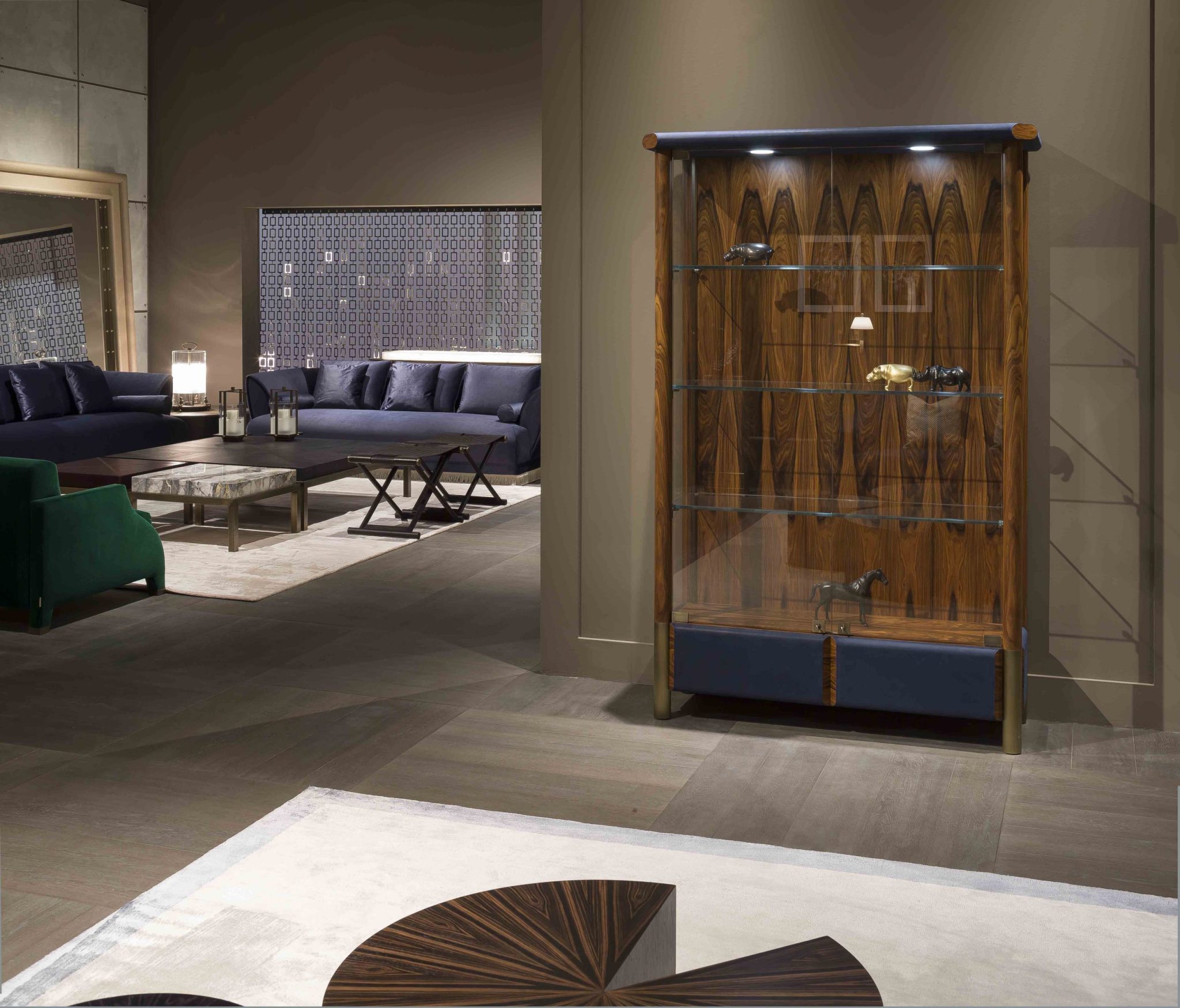
The first major trade event of 2019 recently took place in Milan. From 9th to 14th of April 2019 Bellavista Collection showcased its exhibits at the 58th edition of Salone Internazionale Del Mobile. Visitors enjoyed the new collection of pieces, many of which were created shortly before this event. Also, they clearly noticed the change of the brand’s color palette, with blue as a new favorite. Blue color virtually dominated Bellavista’s exhibitor booth at iSaloni: upholstery of the sofas and dining chairs, as well as details of other pieces such as drawer fronts, were in various shades of blue. Only two FILOMENA armchairs stood out, being deep green.
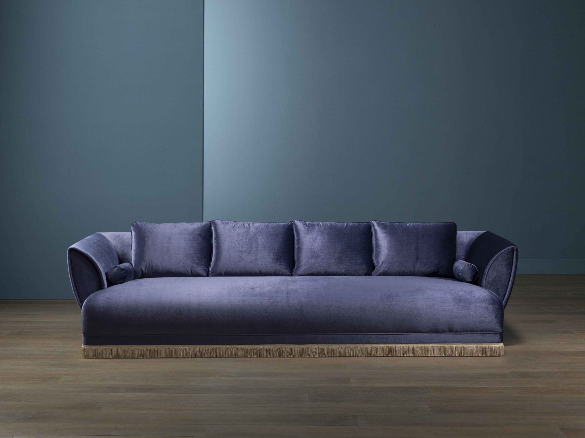
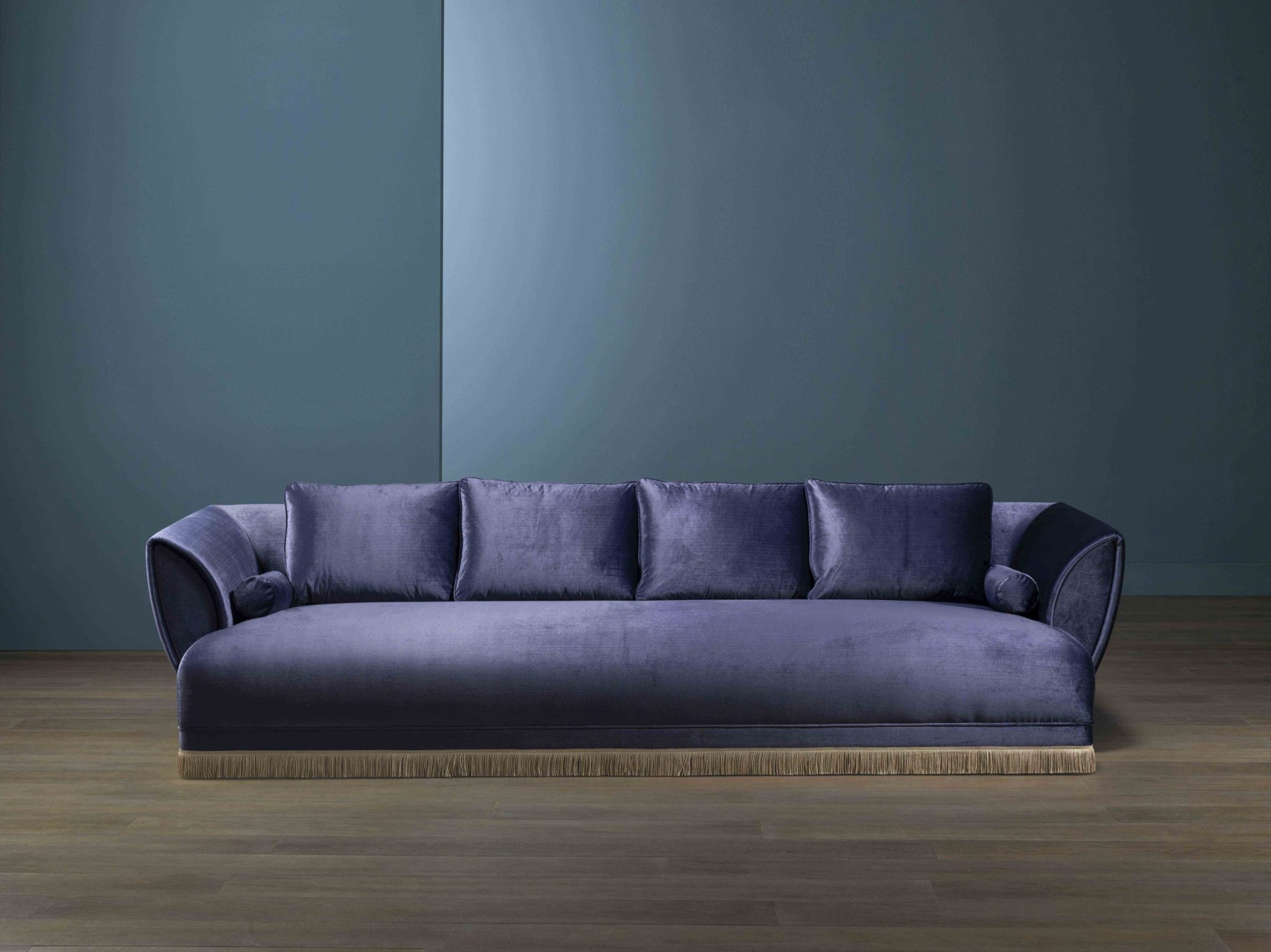
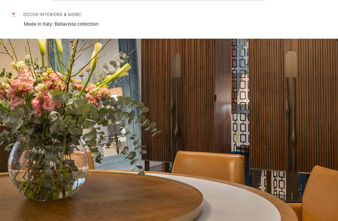
Navy blue velvet of two AVUELA sofas perfectly combined with light pink carpet on the floor and dark brown wood of low coffee tables. Deep blue covers of MATILDE sofa, made of top-quality leather, looked matchlessly elegant and luxurious. So did KATE LOW dining chairs, also upholstered in blue leather.
MY CHESTER sofa, upholstered in pale turquoise velour, was one of a few exhibits, which had been already known to the public. This remarkably-looking sofa was designed in 2018 – you can see it on Bellavista’s website.
There are also other showpieces with blue leather details. For example, the display cabinet named ASPEN had drawer fronts and some details covered with blue leather. ASPEN, with its combination of transparent glass, rosewood and prime-quality leather looked remarkably and turned visitors’ heads.
So did TUDOR gorgeous-looking sideboard. This furniture piece by all means deserved its royal name. It was shown in in two versions – TUDOR Bar and TUDOR cabinet – and both are fit for a king. As it’s clear from their names, the first variant of TUDOR is a bar unit, and the second one is intended for keeping various valuables. Decorative brass studs made this sideboard a real eye-catcher. Front parts of the drawers in both versions, covered with blue leather, naturally complement its overall look. So do the edges of the removable walnut tray in TUDOR Bar.
The exhibition is over, but it doesn’t mean that we’ll never see these grand-looking showpieces. We definitely will, and pretty soon. Bellavista Collection doesn’t prepare showpieces for trade shows only – all the exhibits appear at Bellavista Collection’s website shortly after the event. So, in a little while any of them will be a mouse click away from you.


