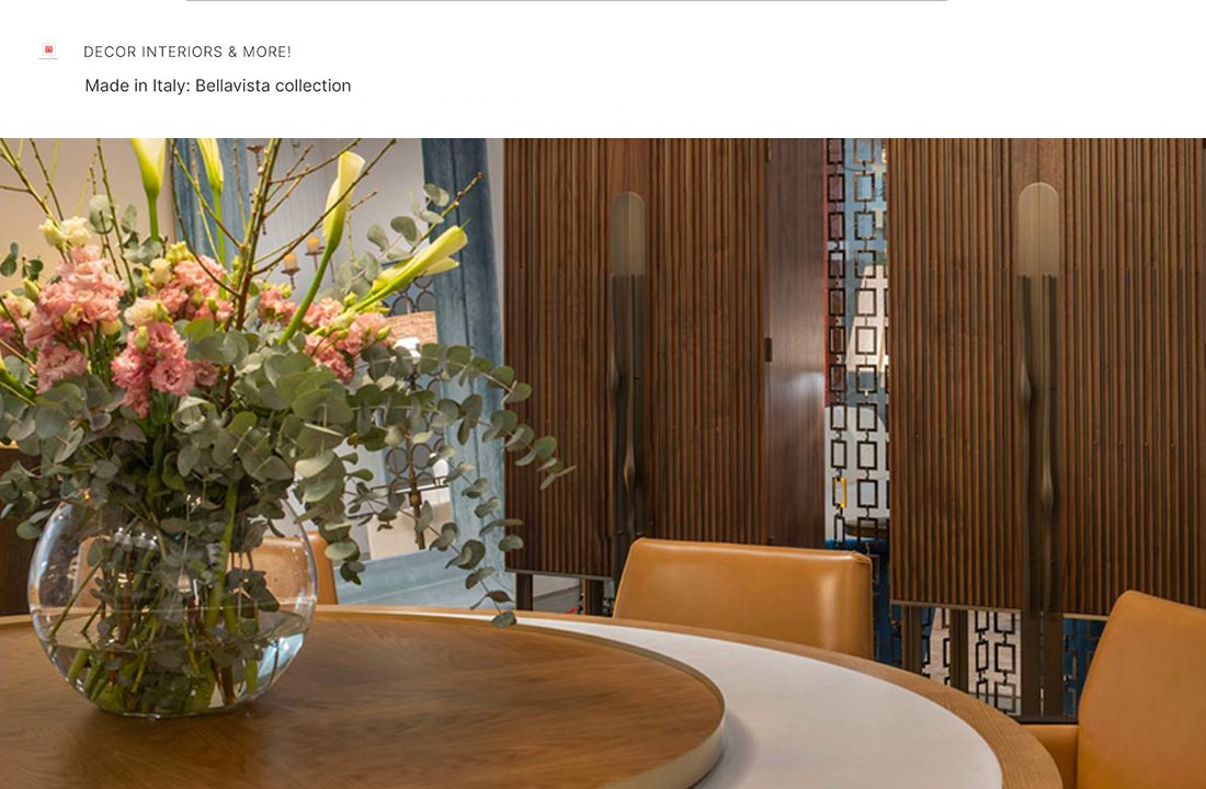
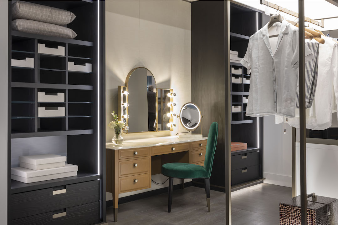
About a year ago, at the last year’s edition of Salone Internazionale del Mobile, it was obvious that Bellavista Collection, a well-known producer of Italian luxury furniture, had changed its color palette, adopting blue as a new favorite. There was plenty of blue color in Bellavista’s exhibitor booth at iSaloni 2019.
Two AVUELA sofas upholstered in classic blue velvet virtually dominated the space. Leather covers of MATILDE sofa were of the same color, but of a bit lighter shade. A few other colors Bellavista used for upholstery of its showpieces, included pale turquoise (MY CHESTER sofa) and rich green (two FILOMENA armchairs).
Along with blue upholstery, some other Bellavista’s furniture pieces had details wrapped in blue leather – for example, drawer fronts of ASPEN display cabinet and both versions of TUDOR sideboard – TUDOR Bar and TUDOR Jewels. So were the edges of the removable walnut tray in TUDOR Bar.
Two elegant floor lamps, designed in 2019 and showcased at iSaloni 2019 – ADALPINA an FAROLITO – had handy trays, bottoms of which were also covered in blue leather.
Attilio Zanni, Bellavista Collection’s extremely talented all-round designer and the company’s co-founder, has always been good at combining materials and showing the natural beauty of each one. A wide assortment of woods and marbles; cast metal with a variety of attractive finishes; glass, fabric, leather – Bellavista’s craftsmen manage to make the most of these materials when creating pieces that turn heads at prestigious trade events.
Now you can find these showpieces all in one place, namely in ‘What’s New’ section of Bellavista Collection’s website. According to a long-standing tradition, all the exhibits appear there shortly after each trade event and become available to all.
In fact, blue color has long been among the favorites in Bellavista. If you visit the brand’s website and look through the upholstered furniture from the previous collections, you’ll easily notice that a good many of them offer an option with blue covering. Take a look at Big John and Little John sofas or ANGELINA dining chair, for example. Or at the monumental NAPOLEONE sofa upholstered in bright blue velvet.
This trend will by all means continue in 2020 – you’ll be able to see it for yourself pretty soon. The 59th edition of Salone Internazionale del Mobile is going to take place in less than a month: between April 12 and 26, 2020. Although little is known about Bellavista’s future exhibits before the event, there surely be showpieces with an accent on blue upholstery or details.
And it isn’t all about Bellavista’s tastes and preferences: Classic Blue, which was one of Bellavista’s favorites in 2019, has been proclaimed Pantone Color of the Year 2020.
Classic Blue: Pantone Color of the Year 2020
What are Pantone colors? Professionals from a variety of industries, including textile manufacturing and interior design, widely use these color codes, which stand for particular tones and shades. Pantone Matching System (PMS) is a well-known proprietary color space developed in Pantone LLC.
For already two decades – since 2000 – Pantone Color Institute, which is a part of Pantone LLC, has been declaring a particular shade ‘Color of the Year’. For example, in 2019 it was Living Coral – a shade of orange color with the Pantone code 16-1546.
Many experts worldwide consider Pantone Color Institute to be the most authoritative source of information on using various colors and their shades, although in fact it is only a consulting agency. When it comes to trending colors, Pantone Color Institute is not a trendsetter at all; it only collects the data and reflects them in its annual report. Also, this firm makes forecasts about global color trends and advises manufacturing companies on using certain shades for their brand logos and new collections of goods.
In December 2019, this globally recognized authority named the color of the year 2020. It is Classic Blue – a medium dark shade of cyan-blue. Pantone code of this color is 19-4052, and its hexadecimal code is #0f4c81.
Experts from Pantone Color Institute said that they chose this hue because it instills “calm, confidence, and connection”. Just take a glance at this shade, reminiscent of the sky at dusk, and you’ll agree that it seems really soothing.
Color of Tranquility and Endurance
We can say from experience that colors of surrounding objects can influence our mood greatly. Looking at different colors does evoke particular feelings and emotions, and the branch of science named color psychology thoroughly studies this phenomenon.
Artists, designers, and other professionals who constantly deal with colors, as well as their numerous shades, tints, hues, and tones, have a plethora of their classifications. Ordinary people, however, prefer the simplest one and divide all colors and their shades into two large groups: “warm” and “cool”. Red, orange, and yellow colors and their shades are quite predictably called ‘warm’. They are commonly associated with fire and sunshine, so these colors raise spirits and generally feel vibrant, vigorous and jolly. Red, for example, is associated with love and passion in many cultures.
As for the colors and shades from the ‘cool’ group – blue, green, and purple – they tend to instill tranquility, bring peace of mind. No wonder: looking at the blue sky or sea waves has always been the best way to calm down and relax. Color psychologists say that in many cultures blue color symbolizes tranquility and inspiration, as well as reliability, stability, and endurance. Also, blue is considered the color of truth and wisdom.
It is therefore not surprising that Classic Blue has become the Color of 2020. These days our lives are full of stresses; many of us are constantly facing new challenges, so we all surely will need plenty of tranquility and endurance in 2020 and beyond.


